It looks like the web interface (frontend) for Google Play just got a new look. They’ve gone for more of a grid layout, with most data loaded dynamically using AJAX.
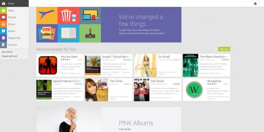
I was just discussing this with @Jagger on IRC, who first pointed it out to me. It seems to fit in with the style of the new Play Store on Android, as well as the latest Google Maps. But it’s missing a few important features. There are no longer multiple pages of search results - you can only see the top results for any query. And featured graphics seems to have disappeared altogether.
What do you think of the new look?