(Long, but worth the read) My app looks dull and amateur-ish. I’ve stopped every other improvement, performance tweaks, adding more content - just to try and improve the UI.
But I’m absolutely stumped when it comes to graphics and UI design. In the six months it’s been on the play store, I don’t remember making any very noticeable changes to the UI… I want to change that.
But I need suggestions, as many as possible. Kindly take a peek at the screenies here: https://play.google.com/store/apps/details?id=x.abcd
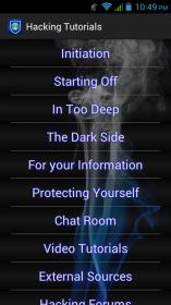
Here’s the main menu:
A bit more information:
My app is mainly about tutorials on hacking. I consider myself a pretty decent writer, so the last thing I need is the users uninstalling my app because of the UI. Right now, it just lists down the various sections of the app (categories of hacking tutorials). Clearly, it’s not very good. I’m thinking something like one major button “Author tutorials” and a small lists of everything written by me, another button “From the internet” with stuff like videos and external sources besides it… maybe a random hacking/computer related quote at the bottom of the screen… but I don’t know how to make it all fit together.
Any suggestions will be greatly appreciated ![]()